Till Attack: A Bold Display Font for Impactful Web Design
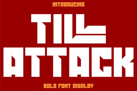
As a UI designer who ships dozens of landing pages, SaaS dashboards, and e-commerce experiences each year, I reach for Till Attack when the message needs to land—not just be seen. It’s not a workhorse body font or a subtle accent. Till Attack is a display font built for presence: thick strokes, high contrast, tight spacing, and unapologetic weight. On screen, it reads like a visual exclamation point—structured, confident, and instantly legible at scale.
In practice, Till Attack thrives where attention is scarce and intent is high. Think hero section headlines on product launch pages, bold CTA buttons in conversion-focused layouts, or shop banner text that cuts through scroll fatigue. Its heavy geometry gives digital interfaces an anchored, grounded feel—especially effective for brands rooted in craftsmanship, fitness, tech hardware, or creative studios. Unlike overly decorative display fonts, Till Attack avoids visual noise; its letterforms are clean, consistent, and engineered for pixel-perfect rendering across modern browsers and devices.
Where Till Attack Earns Its Place in Your Layout
Till Attack isn’t meant for paragraphs—or even long subheadings. Its strength lies in controlled, intentional application:
- Hero titles (60–90px on desktop, scaled responsively to 42–56px on mobile)
- Section headers that introduce key value propositions or feature clusters
- CTA buttons with short labels (“Get Started”, “Join Now”, “Shop Collection”)
- Logo lockups and wordmarks for startups, boutiques, or personal brands prioritizing memorability over subtlety
- Digital ad banners and social media cover graphics where clarity trumps elegance
On a coaching website, Till Attack sets tone before the first sentence loads—communicating authority and action. In an online store for artisanal tools, it reinforces durability and precision. For a portfolio site, it frames project names as statements rather than labels. The font doesn’t whisper brand values—it declares them.
Readability & Responsiveness: Practical Considerations
Like any strong display font, Till Attack requires thoughtful implementation for readability. At smaller sizes (<32px), letter spacing should be manually increased (via letter-spacing: 0.04em or similar) to prevent crowding. On mobile, avoid using it below 28px—even then, limit it to single words or two-word phrases. Always test against both light and dark backgrounds: its dense strokes hold up well on dark mode UIs, but ensure sufficient contrast (at least 4.5:1) for accessibility compliance.
When layered over imagery—especially textured or busy backgrounds—add a subtle text shadow (text-shadow: 0 2px 4px rgba(0,0,0,0.3)) or a semi-transparent overlay behind the text block. Never stretch or distort Till Attack in CSS; its impact relies on native proportions. And avoid all-caps usage unless intentionally stylized—the font already carries enough visual weight without capitalization amplifying density.
Smart Pairing for Balanced Digital Typography
Till Attack pairs most effectively with highly legible, neutral sans serifs—think Inter, Manrope, or IBM Plex Sans—for body copy, navigation, and form labels. This contrast creates clear visual hierarchy: Till Attack commands focus, while the supporting font delivers information without friction. For editorial or luxury-facing sites, a restrained serif like Cormorant Garamond or Lora works beautifully in headings *beneath* Till Attack—say, a bold Till Attack title followed by a refined serif subtitle.
Avoid pairing Till Attack with other heavy or decorative fonts. No script fonts, no condensed grotesques, no handwritten alternatives. Its personality dominates. Let it anchor the top of the typographic stack—and let your secondary font handle nuance, rhythm, and reading comfort.
Licensing, Formats, and Real-World Use
Till Attack is a commercial font, and licensing matters—especially in client work. Most reputable vendors offer webfont licenses covering self-hosted files (WOFF2 recommended), CDN delivery, and unlimited pageviews. Confirm whether the license permits use in SaaS dashboards, white-labeled templates, or downloadable brand kits. Some licenses restrict use in logo assets sold to third parties—always verify before embedding in a client’s Shopify theme or Figma design system.
The typeface typically includes a single robust weight (Bold or Black), often with standard Latin character support and basic diacritics. If your audience includes French, Spanish, or German speakers, confirm multilingual coverage before finalizing. While Till Attack doesn’t offer variable axes or stylistic alternates, its consistency across weights and languages makes it predictable in production—no unexpected glyph swaps or rendering hiccups.
For designers building reusable components—like Figma UI kits, Webflow templates, or WordPress themes—Till Attack adds instant distinction to headline variants without bloating load times. Its compact file size (typically under 40KB WOFF2) means no meaningful performance penalty, even with multiple font-display strategies applied.
Ultimately, Till Attack serves a precise role: turning static text into a deliberate design decision. It won’t solve weak messaging—but paired with strong content and intentional layout, it elevates clarity, sharpens brand voice, and supports user action. In a landscape saturated with safe, blended-in typography, Till Attack is permission to be unmistakable.