Rushford: A Bold Display Font for Digital Brand Impact
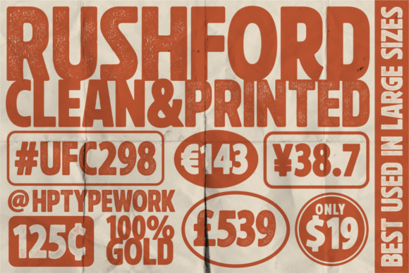
As a web and UI designer, I reach for display fonts like Rushford when the goal is immediate visual authority—when a headline must anchor attention, a logo must project confidence, or a call-to-action button needs to feel decisive. Rushford isn’t subtle. It’s clean, boldly structured, and purpose-built for digital prominence. Its sharp geometry and confident stroke contrast give it presence without clutter—ideal for interfaces where clarity and tone matter as much as aesthetics.
Rushford belongs squarely in the Display category, meaning it shines best at larger sizes: hero section titles, landing page headers, app onboarding screens, and branded banners. It’s not intended for body copy—but that’s by design. Its strength lies in shaping first impressions, guiding the eye, and reinforcing brand personality in under two seconds. Think of it as your visual handshake: firm, intentional, and memorable.
In practice, Rushford excels across high-impact digital contexts. On a SaaS product landing page, it transforms “Get Started Today” into a statement—not just text, but a signal of capability. For a boutique online store, it elevates product category banners (“Handcrafted Ceramics”, “Limited Edition Prints”) with refined assertiveness. Coaching websites use Rushford for taglines (“Clarity. Confidence. Growth.”) to convey expertise before the first paragraph loads. And creative portfolios leverage its bold rhythm to make project titles pop against minimalist layouts—no extra styling needed.
Readability remains strong—even on mobile—because Rushford avoids decorative excess. Its open counters, generous x-height, and consistent letter spacing ensure legibility at 32px and above, even on lower-DPI screens. For responsive layouts, I recommend setting Rushford at ≥48px on desktop, scaling down to ≥36px on tablets, and using ≥28px on mobile hero sections—always with generous line-height (1.1–1.25) and ample padding around the text block. On dark backgrounds, pair it with a crisp white or light neutral; over image overlays, add a subtle semi-transparent background or subtle text shadow to preserve contrast without sacrificing elegance.
Visual hierarchy is where Rushford truly earns its place. In conversion-focused layouts, it creates unmistakable focal points. A Rushford headline followed by a clean sans serif body font (like Inter, Manrope, or IBM Plex Sans) establishes clear information architecture: the display font commands attention, the supporting type delivers detail. This pairing works equally well for blog headers, course sales pages, and email banner graphics—anywhere users scan before they read.
For logo design and brand identity systems, Rushford offers reliability. Its balanced proportions and lack of idiosyncratic flourishes mean it scales cleanly from favicon-sized app icons to full-width homepage logos. It avoids the dated weight of ultra-bold grotesques while staying more grounded than experimental geometric fonts—making it a smart choice for brands aiming for modern professionalism without coldness. If your brand voice is direct, capable, and quietly confident, Rushford reflects that tone without translation.
Font pairing is straightforward—and intentional. Rushford pairs most effectively with highly legible, neutral sans serifs for UI text, forms, and navigation. For editorial or lifestyle sites, try it with a warm, low-contrast serif like Literata or Crimson Text for body copy—creating a dynamic yet harmonious contrast between impact and intimacy. Avoid pairing it with other display fonts or scripts; its role is singular: to lead, not to compete.
Before implementation, check what’s included. Most premium releases of Rushford offer multiple weights (Light, Regular, Bold), true italics, OpenType features like ligatures and stylistic alternates, and robust multilingual support—including Latin Extended-A and basic Cyrillic. Webfont formats (WOFF2 preferred) should be available for optimal loading performance. Always verify licensing: Rushford is typically licensed per domain or project for commercial use—meaning it’s safe for client websites, online stores, SaaS dashboards, digital templates, and brand asset kits, provided the license covers web embedding and redistribution rights.
One practical note: Rushford performs best when used sparingly and deliberately. Overuse dilutes its impact. Reserve it for primary headlines, key CTAs, logo lockups, and short section labels—never for long paragraphs, data tables, or form fields. In a course sales page, for example, apply it only to the main headline, module titles, and the final “Enroll Now” button. Let the rest breathe with a calm, functional typeface.
It also adapts gracefully to varied digital contexts beyond the browser. Use Rushford in Figma or Framer prototypes to maintain typographic fidelity during handoff. Export SVG versions for animated headers or interactive micro-interactions. Apply it consistently across social media cover images, digital ad creatives, and email header graphics to reinforce cross-channel recognition—especially valuable for marketers building cohesive campaigns.
Ultimately, Rushford supports more than aesthetics—it supports intention. Every time you choose it, you’re choosing clarity over noise, confidence over ambiguity, and digital presence over passive decoration. That makes it more than a display font. It’s a design decision with measurable effect on user trust, engagement speed, and brand recall. Whether you're refining a fintech dashboard, launching an e-commerce brand, or crafting a personal portfolio, Rushford gives your typography the weight it needs to land—without saying a word.